
S2K Commerce - Products Dropdown
Actions
Web Content Viewer
Actions
Using Color Psychology for Product Containers
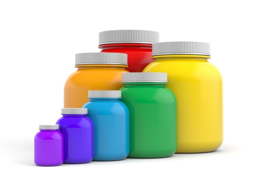
There are a number of factors that any business utilizing containers for their products will be considering with regard to said containers, and color is naturally one of the most important in many situations. As you're considering precise color schemes for any container or product package, the use of color psychology is a common consideration.
At Industrial Container and Supply Company, we're here to offer a huge range of containers, from plastic and glass jars to bottles, cans, drums, pails, and numerous other options. Here's a primer on what color psychology is, plus how many common colors are perceived and what you might think about as you consider them for your containers.
What is Color Psychology?
For those just being introduced to this concept, color psychology refers to the science behind how colors affect our emotions and behavior. Each individual color carries its own unique symbolism and meaning, affecting the way we perceive them.
And within the world of product containers and packaging, color psychology can be used to help create a package that stands out on the shelves and resonates with your audience. It can also be used to indicate certain qualities of your products or to create a memorable and lasting impression.
Our next several sections will look at several common colors, plus the sorts of psychological effects associated with them and how to think about them for containers.
Blue
Often used in custom product packaging, blue is known as a "safe" color that can create a feeling of trust, dependability, and stability. It is often used to represent products related to technology and science, or for those that speak to health and relaxation. Blue is also associated with feelings of calmness and serenity.
Many food and beverage companies love using blue since it is a calming color that catches the eye. Consider pairing blue with other accent colors to create an interesting and eye-catching container design for your product.
Red
Unlike blue, red often conveys a feeling of excitement or energy. Red is known as an attention-grabbing color, making it great for packaging designs that need something extra to stand out in the crowd. It also adds a sense of urgency and calls for action, making it a great choice for limited-time promotions or events.
Red is often used to represent products with an adventurous or daring quality, such as energy drinks, sports equipment, and hot sauces. Pairing red with other colors can add to the effect: white works well to create a classic, bold look; while black can add an edgy feel to your container design.
Green
Green is commonly associated with nature and the environment, making it a popular choice for products related to health and wellness. It is also often used in food and beverage packaging because of its calming properties that can evoke feelings of balance and peace, or with organic products to communicate natural and pure qualities.
Green is also thought to be a color of luck, making it perfect for products related to money or wealth. Use green with other colors like gold to create luxurious, eye-catching designs for your containers and packaging.
White
White coloration signals both cleanliness and simplicity, making it a great choice for products that prioritize hygiene or minimalism. White has an air of innocence and purity, making it perfect for use in products related to health, wellness, and nutrition.
White also works well since it pairs well with other colors to create interesting contrasts. For example, consider pairing white with black or bold shades of blue for a modern look that makes a statement.
Black
For those looking to create feelings of sophistication or luxury, black is the perfect color, It's classic and timeless, suggesting an air of prestige and quality that resonates with customers. Black works especially well for products related to luxury items or high-end fashion.
Black also pairs well with other colors to create bold statements on product containers. Consider pairing black with bright shades of yellow or blue for a modern look that will catch the eye of potential customers.
Yellow
Due to its brightness and cheerful quality, yellow is often associated with happiness and optimism. It's also a great choice for products related to joy and positivity, or those that want to create an uplifting feeling in their containers.
Yellow can also be used to create contrast when paired with other colors, such as black or white. Or you could consider using bright shades of yellow on products that need a bit of extra sparkle and shine.
Using color psychology in product containers is an effective way to create feelings of trust, excitement, or luxury for your products. By understanding how each color resonates with customers, you can create a package design that stands out on the shelves and makes a lasting impression.
At Industrial Container and Supply Company, we're here to help you find the perfect container for your products. Our extensive selection includes everything from plastic and glass jars to bottles, cans, drums, and pails. Reach out today and let us know how we can help you create a packaging design that resonates with customers.